ami entertainment
branding + digital +print + animations
branding + digital +print + animations
an identity that can have distinct factions rolled into one
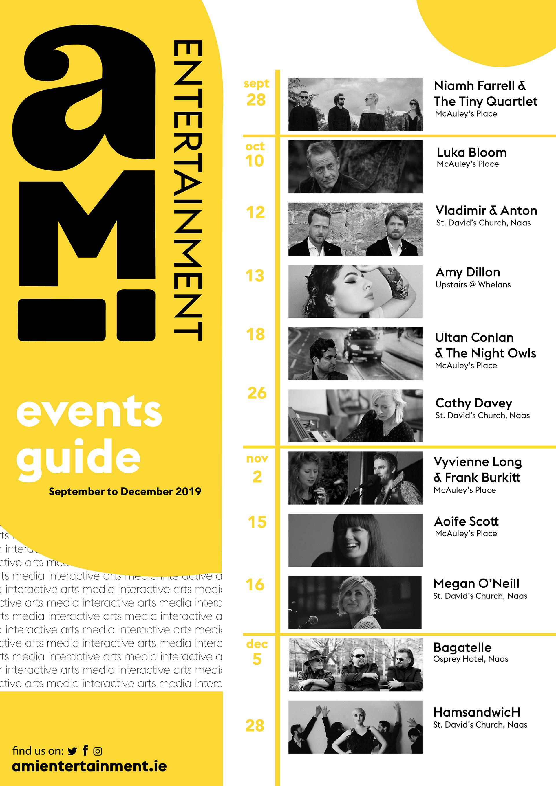
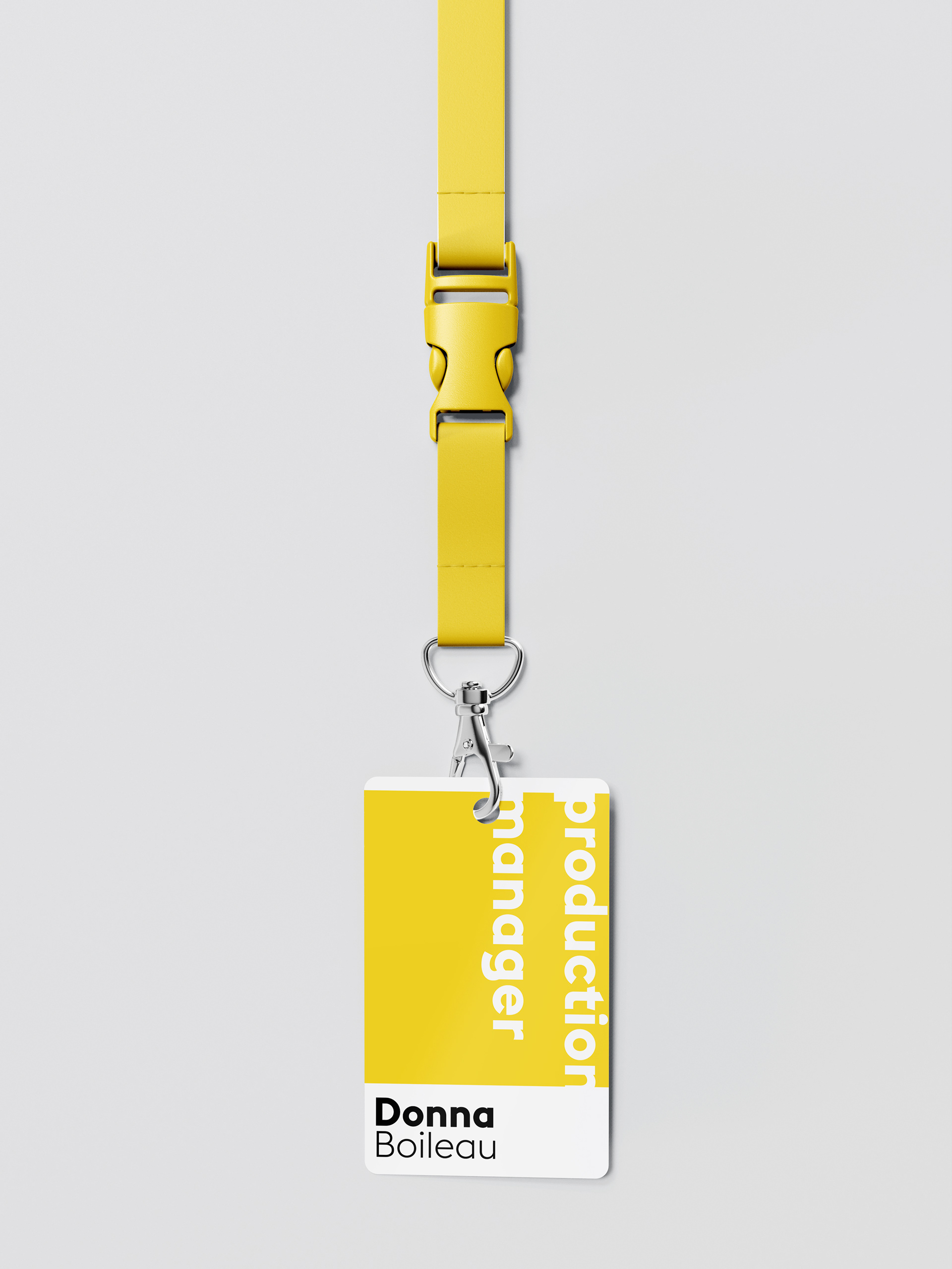
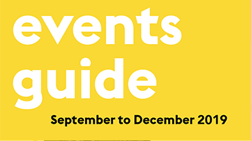
AMI Entertainment is an exciting new production and events management company founded and run by Donna Boileau and Tony Sourke. I was asked to develop an event guide for their Autumn-Winter promotional advertising. However, under closer examination of the existing identity, questions of 'what does AMI stand for?' and 'what voice does AMI have' were asked.
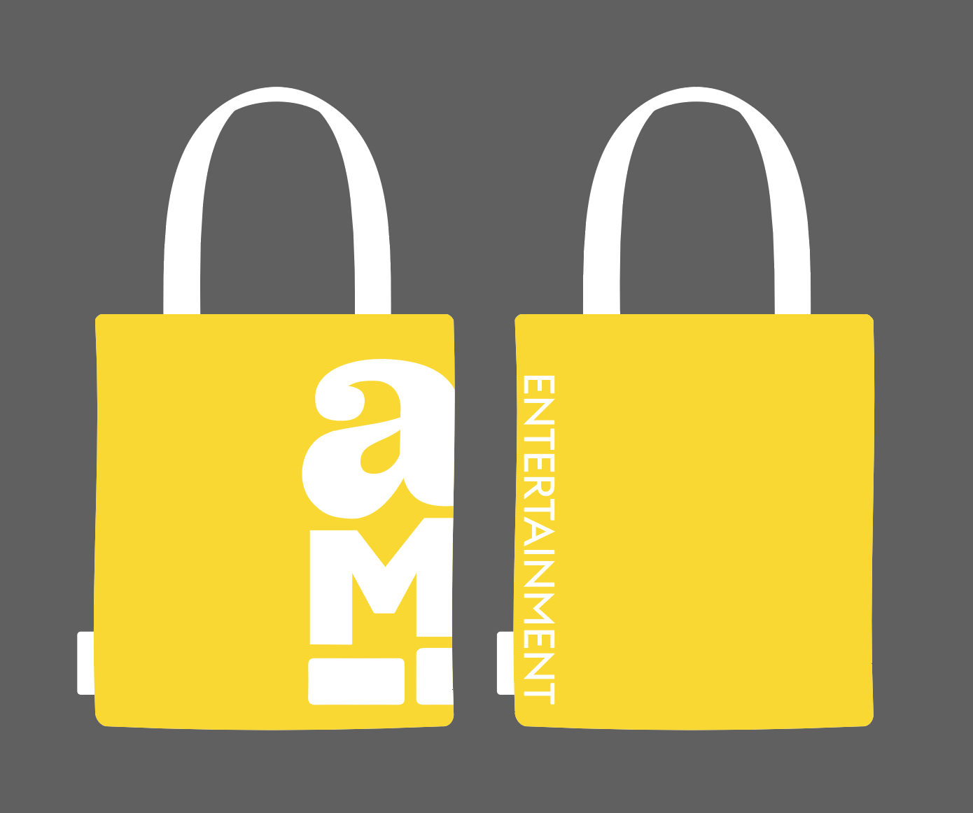
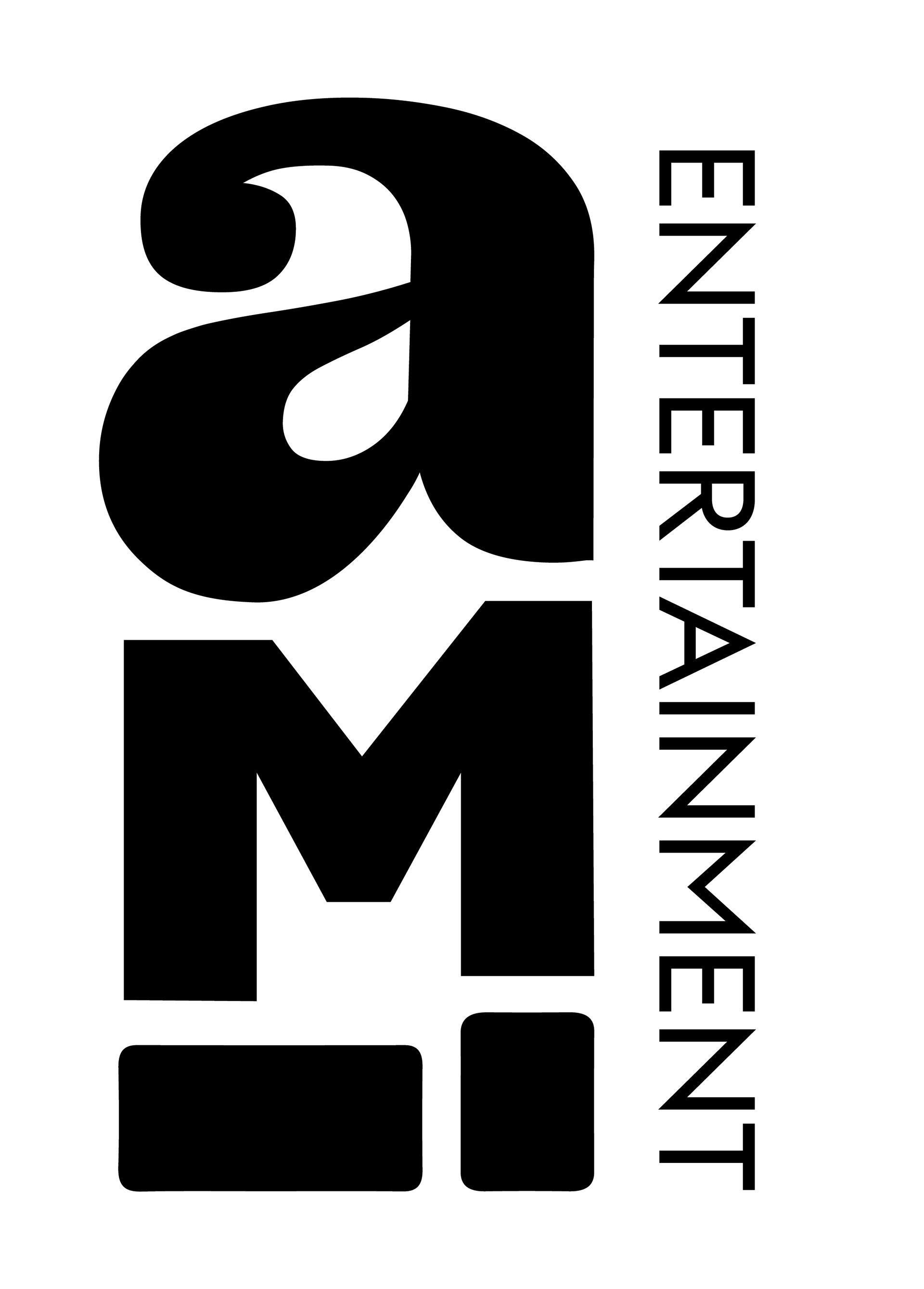
AMI stands for Arts, Media and Interactive Entertainment. All of these types of shows/events are very different, and needed to be expressed in a house style that could marry all three. I created a bespoke logotype and rolled this out into a cohesive visual language to be used for posters, online marketing and more importantly: the event guide.
Each letter standing in for the type of event has its own unique voice, but together they make up the identity. These are also seen in the background of the posters and other collateral.
*photos belong to original photographer and AMI. This case study is still being updated.