the stationery store
identity re-construction + copywriting + visual identity overhaul + packaging
identity re-construction + copywriting + visual identity overhaul + packaging
new look, same great place
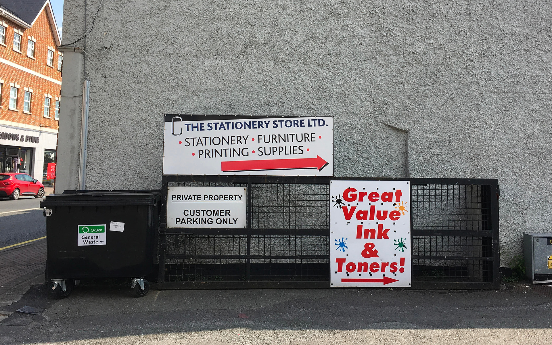
If you live in Naas, you've probably come across this cave of wonders. Situated at the top of the Dublin Road, The Stationery Store has been supporting both businesses and individuals in the area for the last thirty four years.
A family run business, The Stationery Store has been there for its customers through weddings, last minute exam scrambles, that big business meeting and even impromptu Halloween costumes (she wanted to dress as a Cadbury Easter egg!)
Staff here know their customers by name, and what they see is what they get. If they don't have something in stock, you'll find that they will more then likely hunt it down until they find it for you. Friendly, considerate and knowledgeable are surface words to describe here: so how can a design reflect that and help to make the place even better?
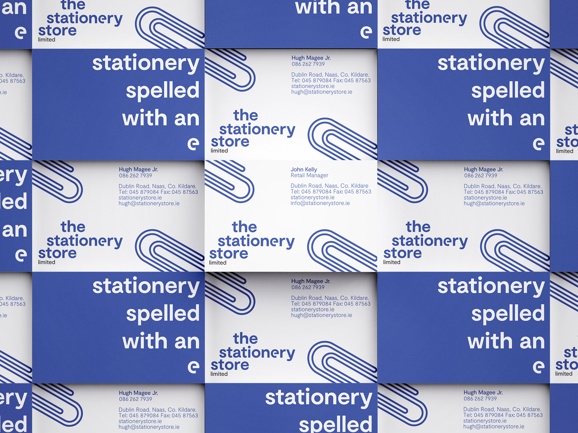
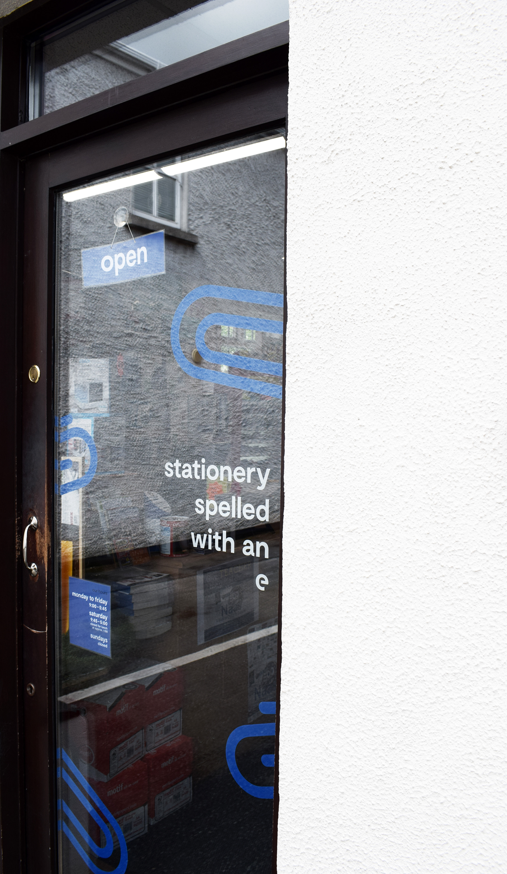
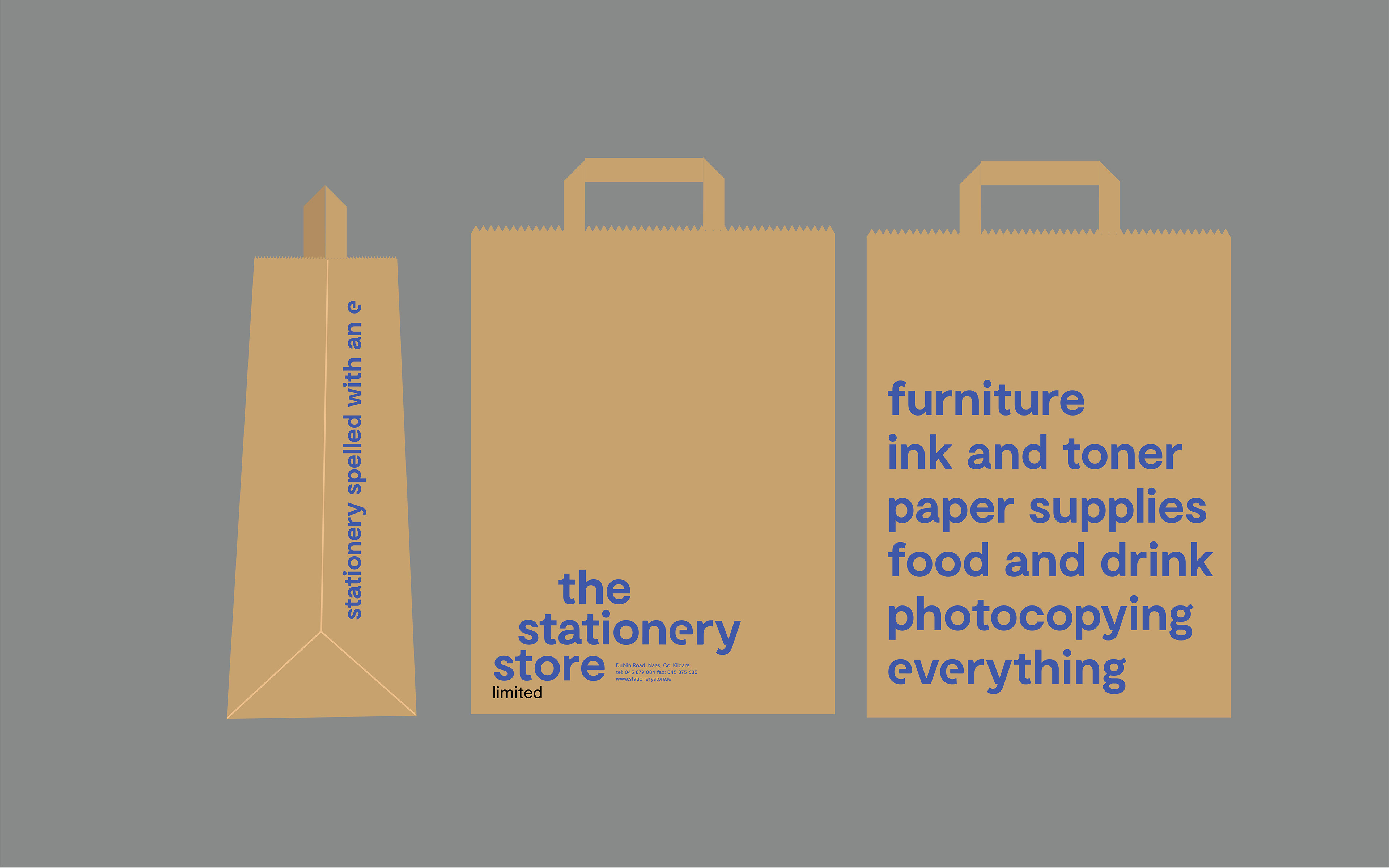
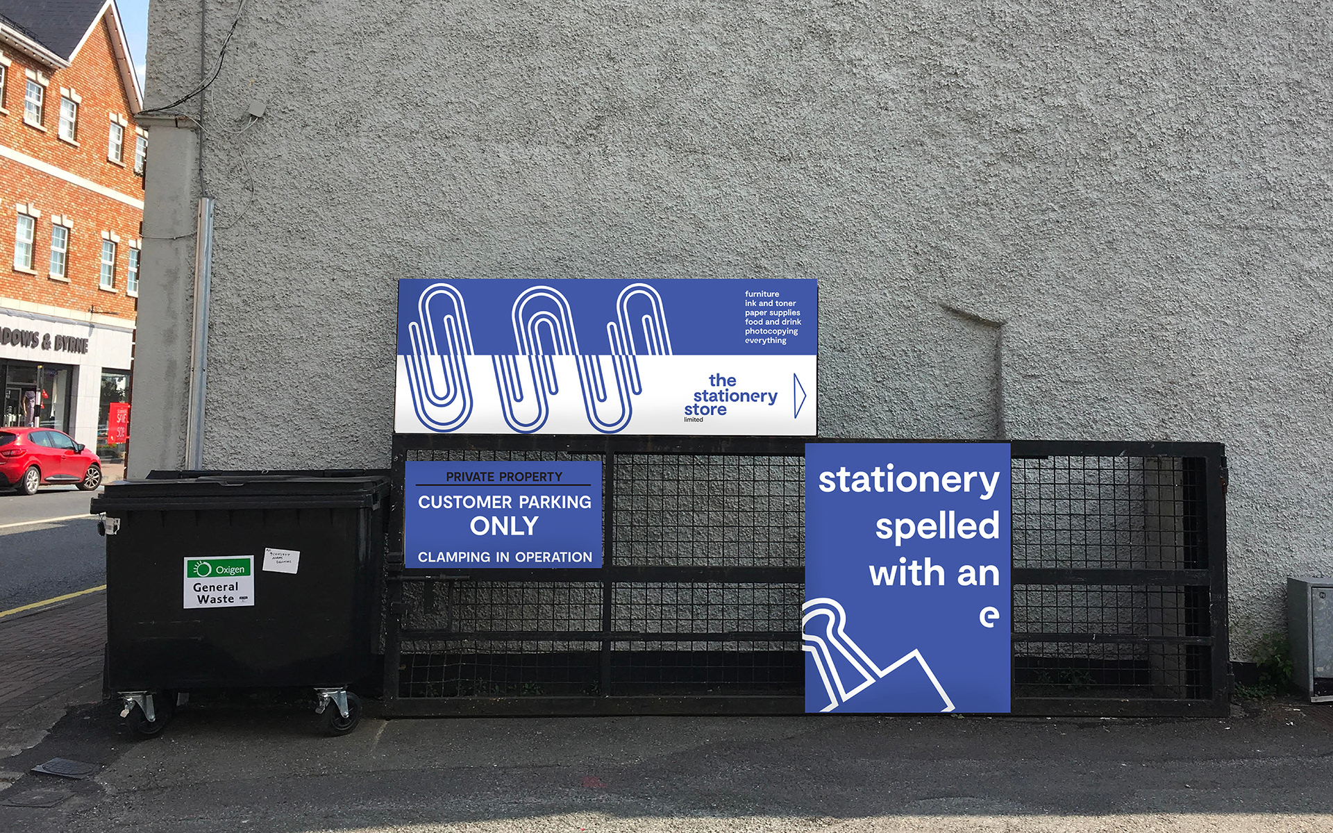
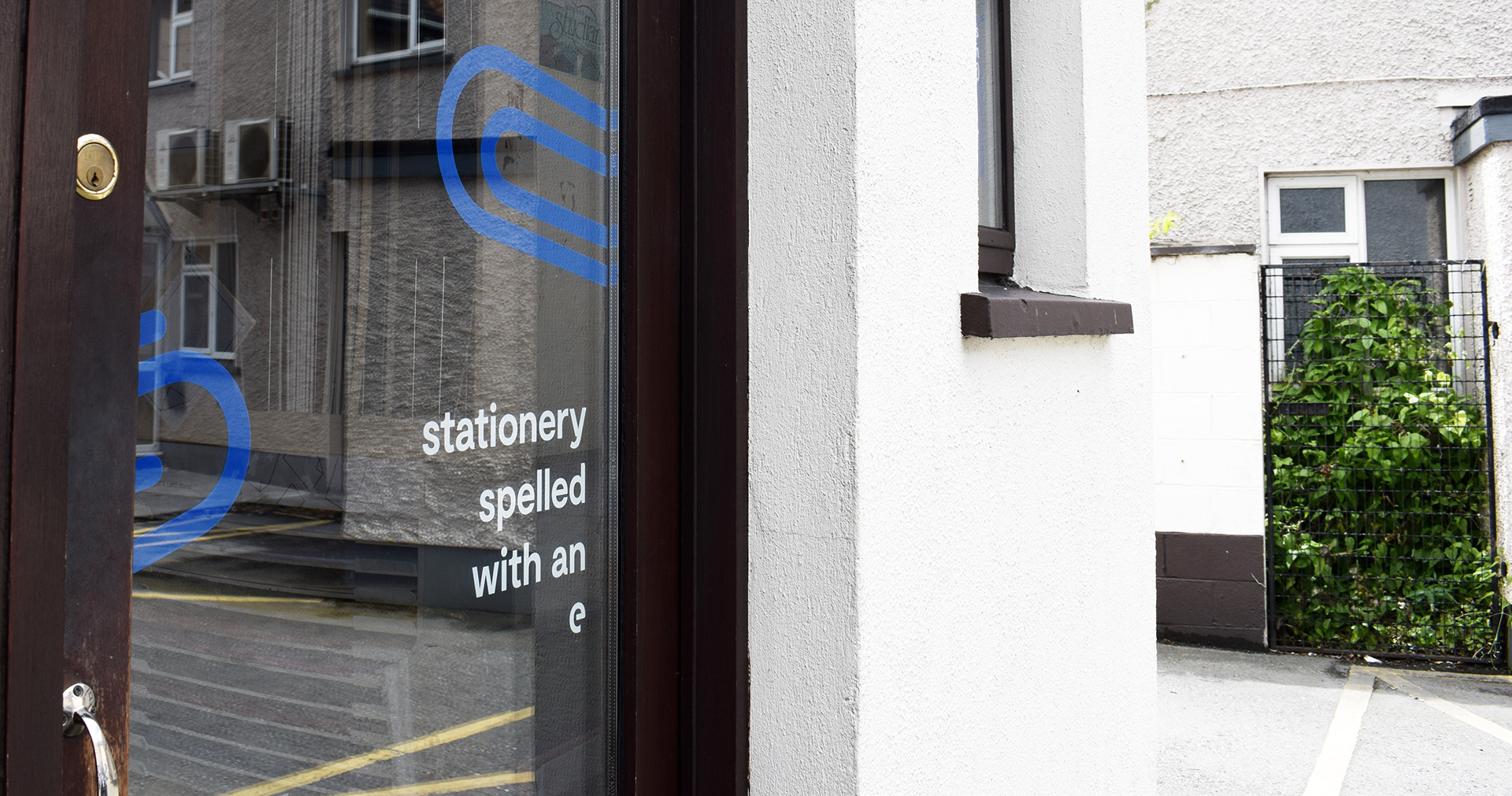
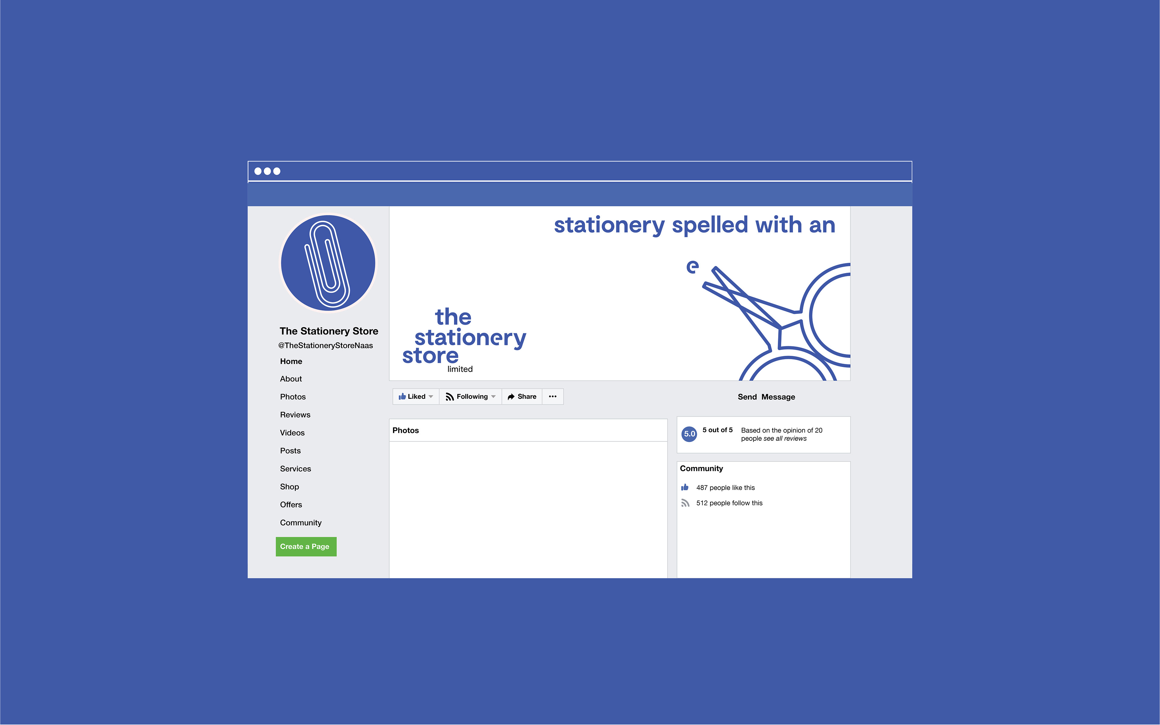
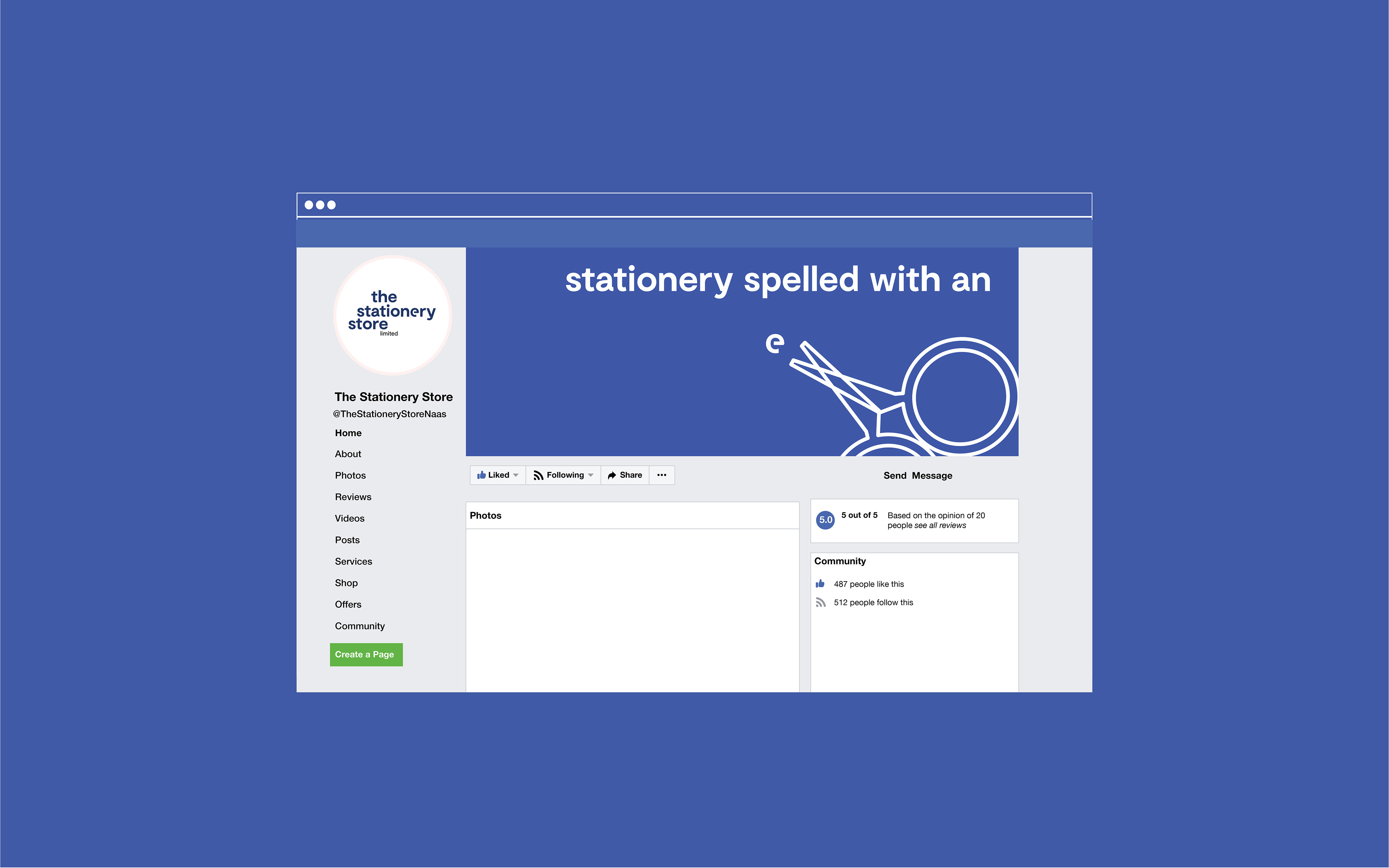
One issue is this: how people spell the word stationery. Did you know that stationery with an a (stationary) is often used by visitors, and actually denotes the meaning of 'standing still?' Stationery with an e is meant for writing and office supplies! There's your fun fact for the day; but also: a problem when it comes to new customers contacting the shop. If you spell it the wrong way, they might never hear from you.
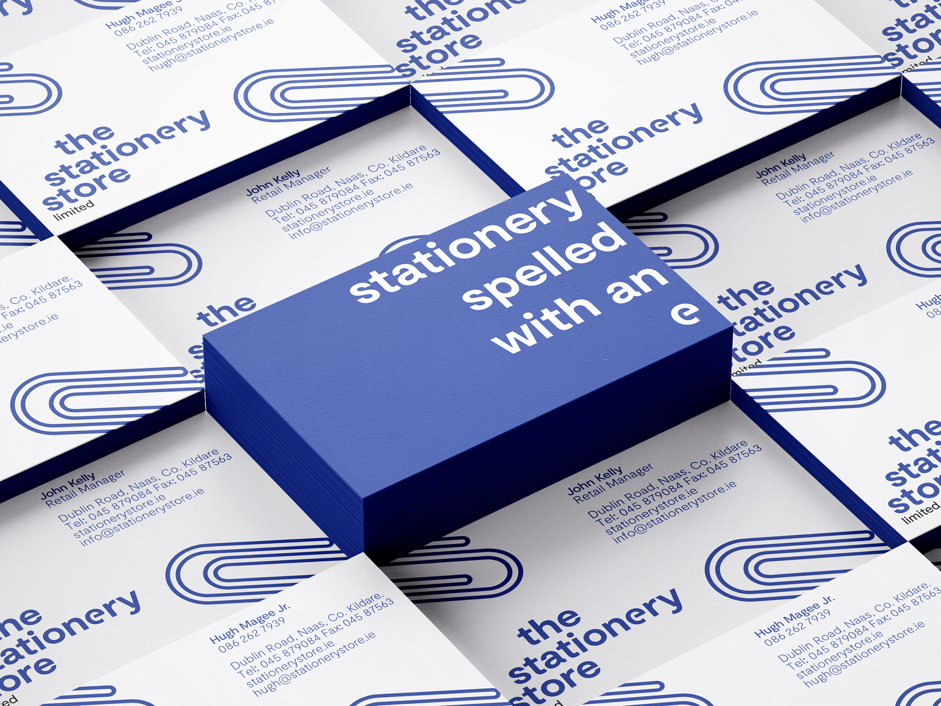
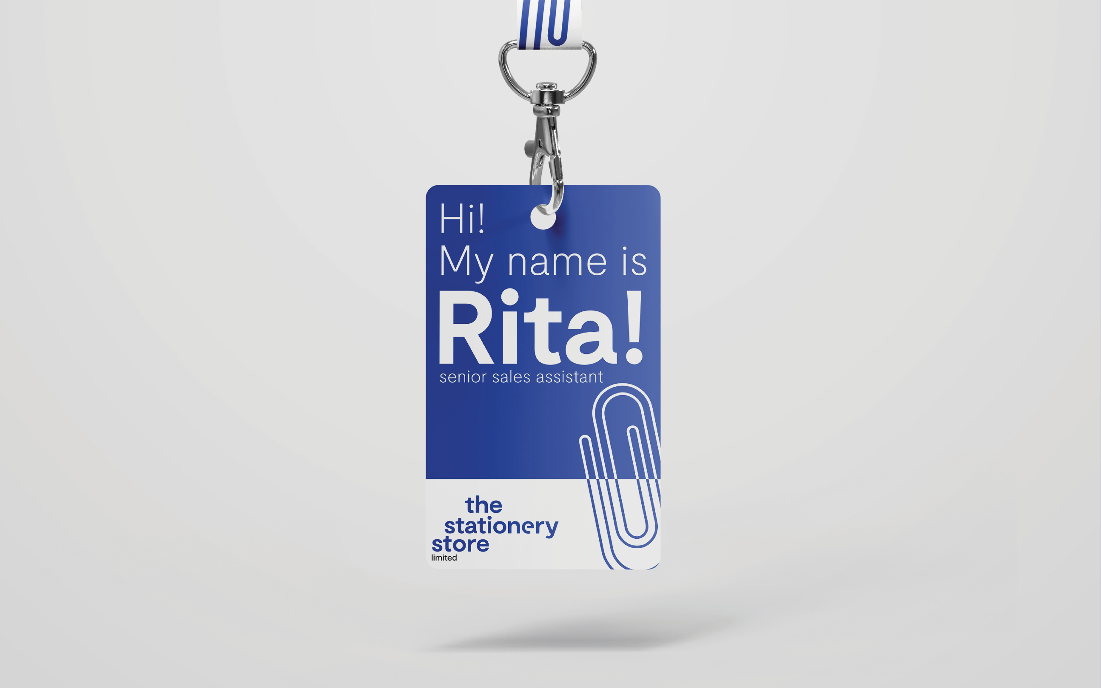
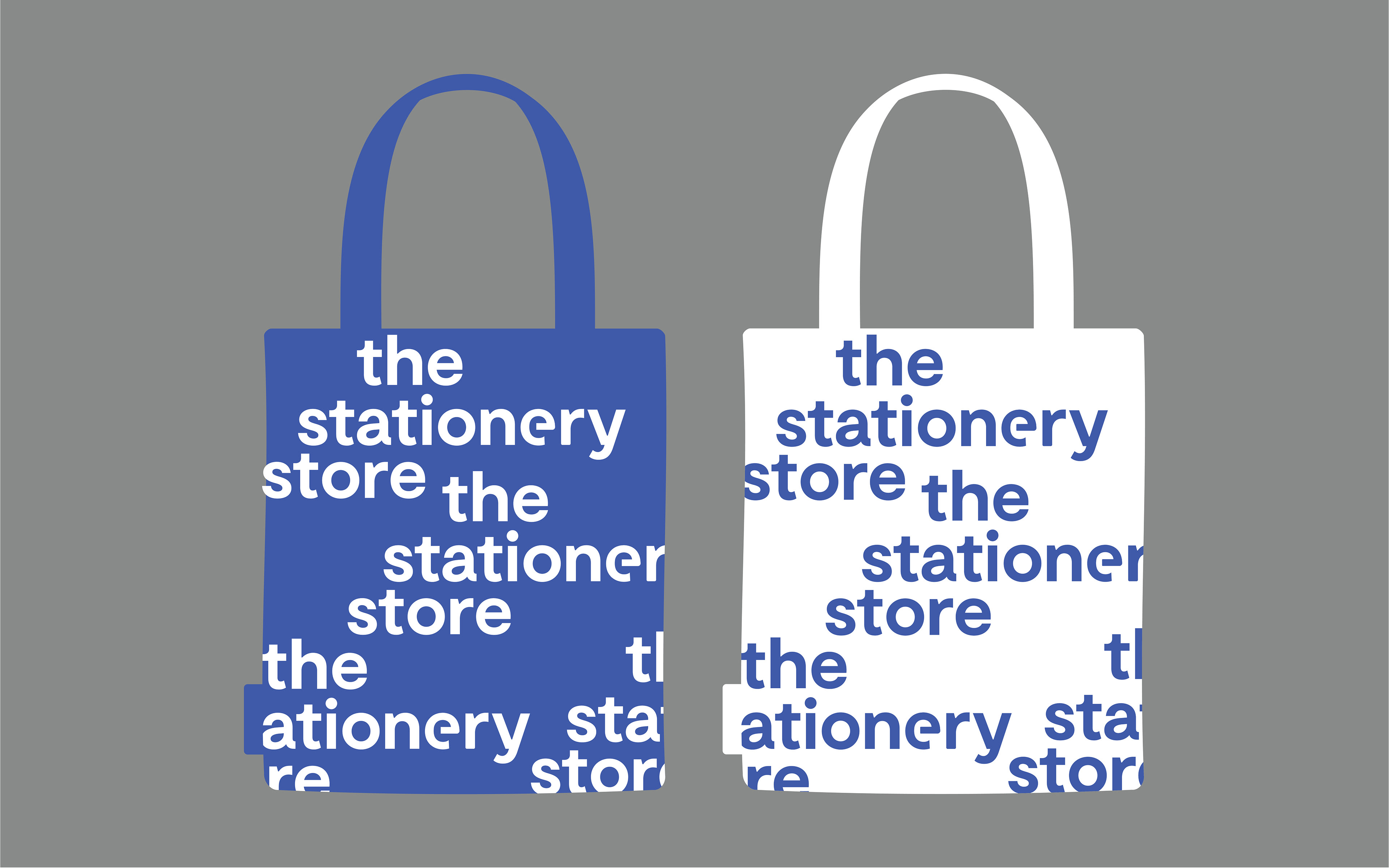
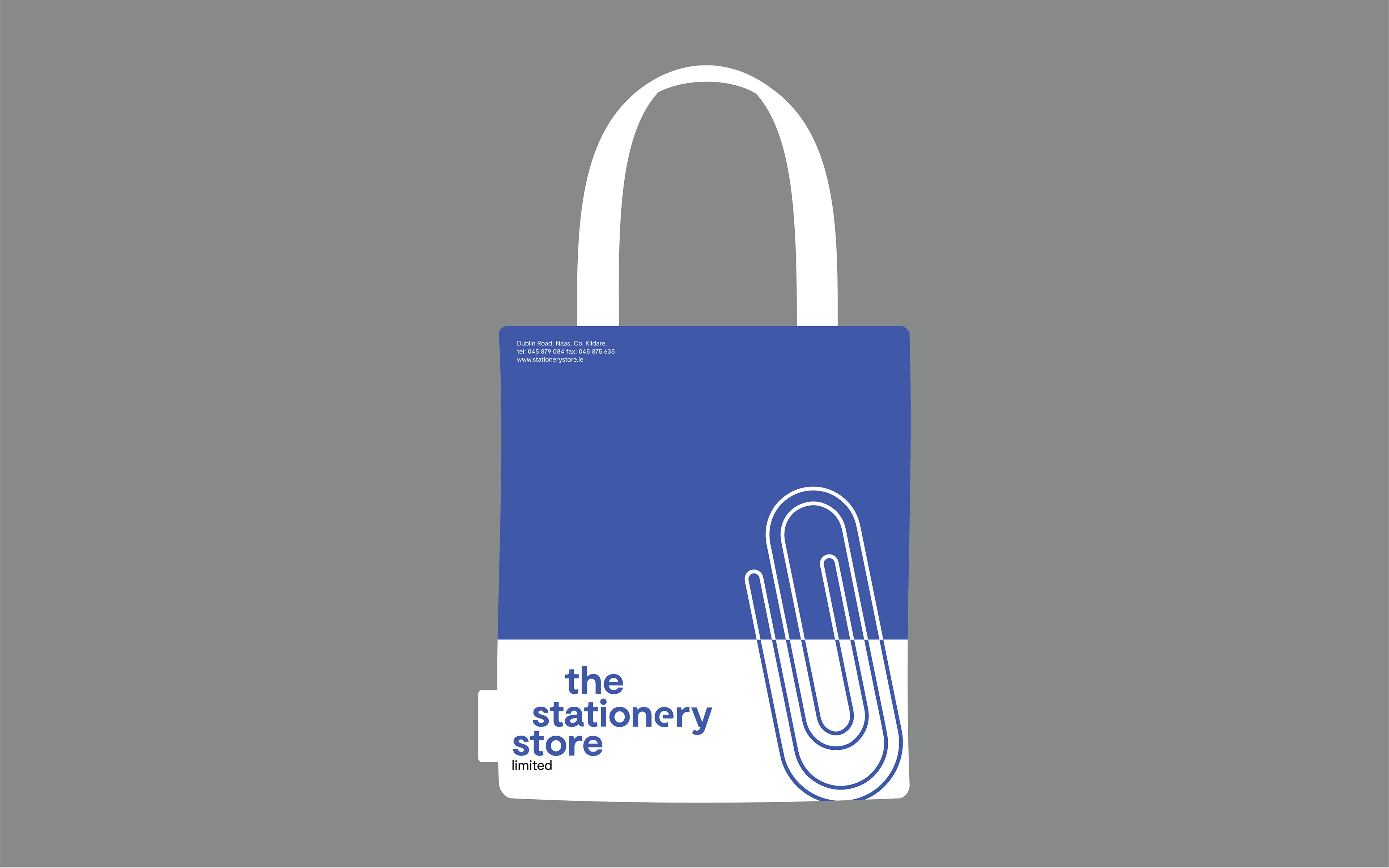
Embracing this as the tag line; an e has been specially adapted to reflect the old branding. It's been 'cut' like a paperclip: another nod to the legacy logo they've worn proudly for the last thirty four years. The logomark has now taken lowercase form; to represent the friendliness and openness the shop offers to their customers.
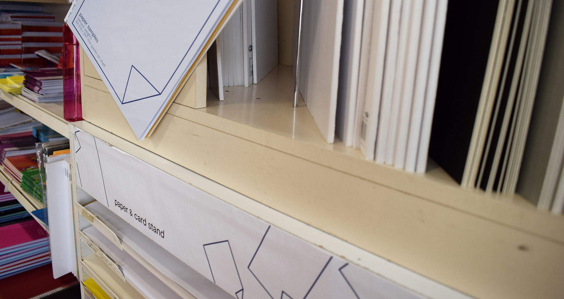
Another observation was that while The Stationery Store supplied more than just office supplies (computer goods, furniture, food and drink, a great priced photocopying/printing service, the list goes on) not many people knew this. Even seasoned customers would be shocked to know the shop sold fans! (well needed on the surprise summer we tend to have)
This became another factor in the identity; listing some of the lesser known offerings on the collateral, and marrying this to the logo. That customised e in stationery stands for (nearly) everything!
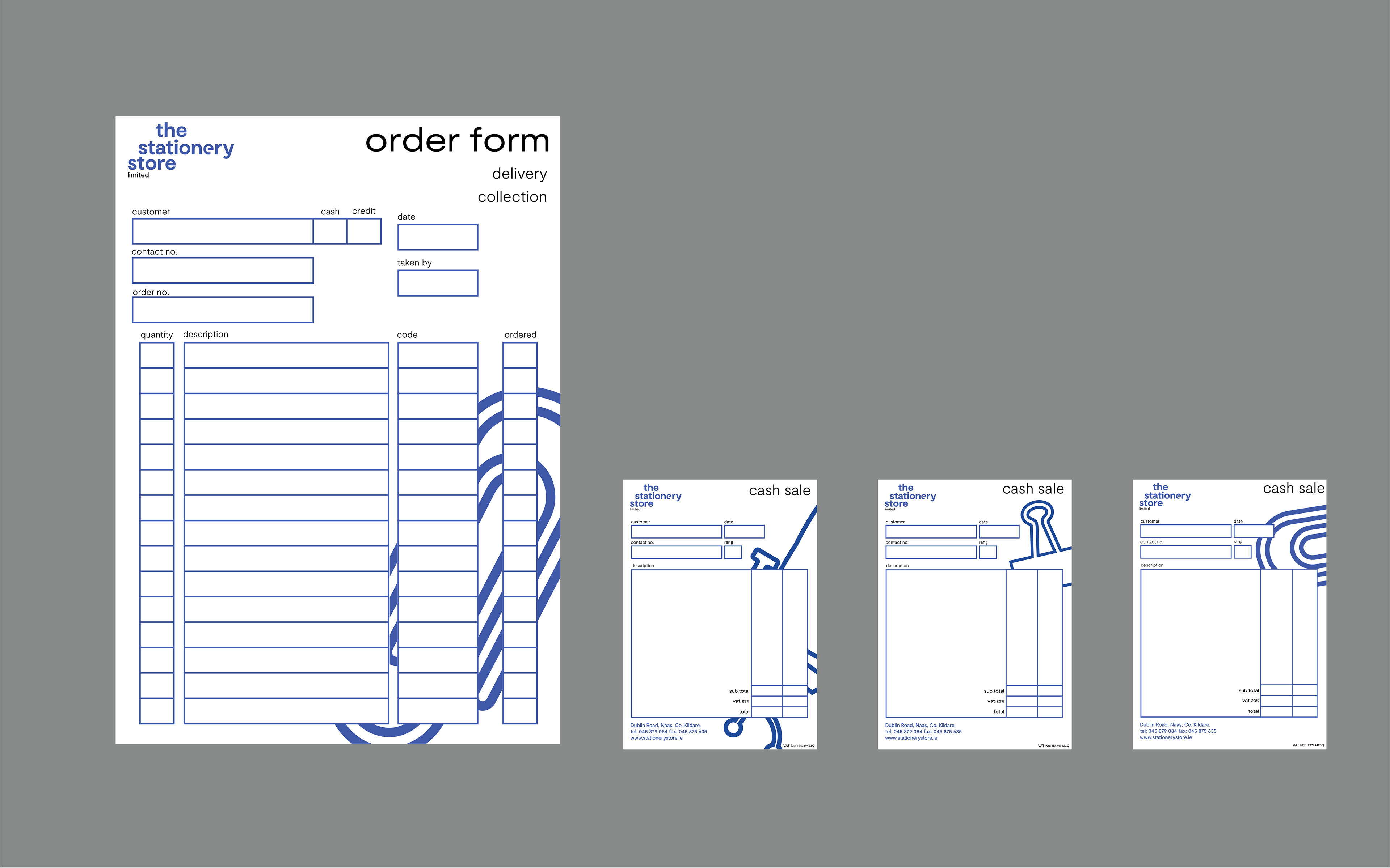
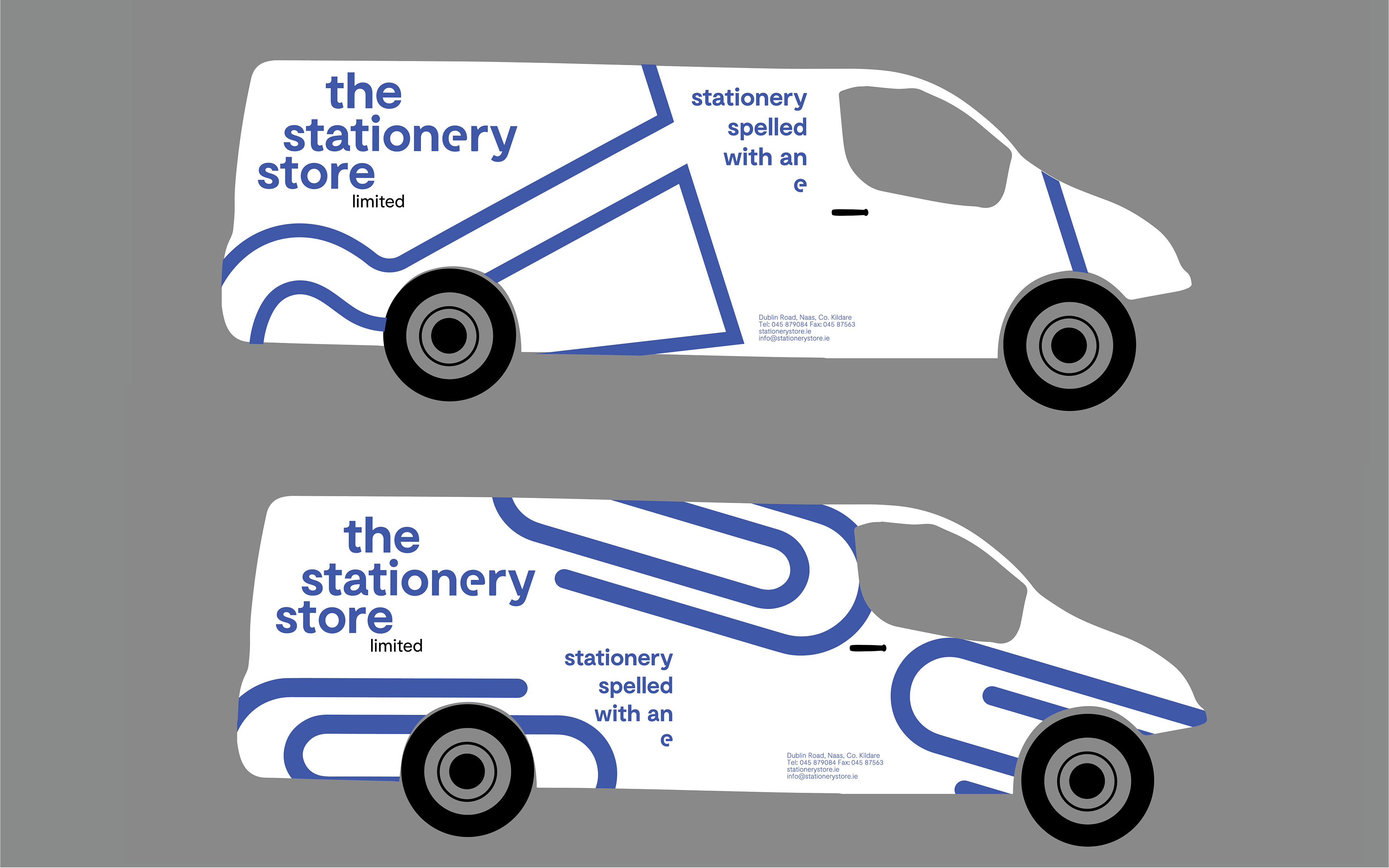
While the typography became a key factor in reigniting the identity, illustration was brought in to continue the new vision across the platforms. Using the paperclip from the original identity as a hero icon, this married the new identity to the old, while adding another layer of the visual language.
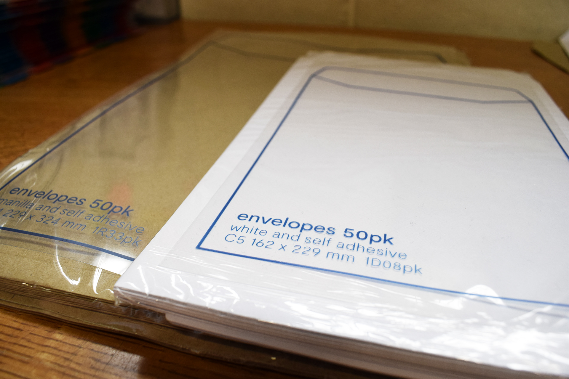
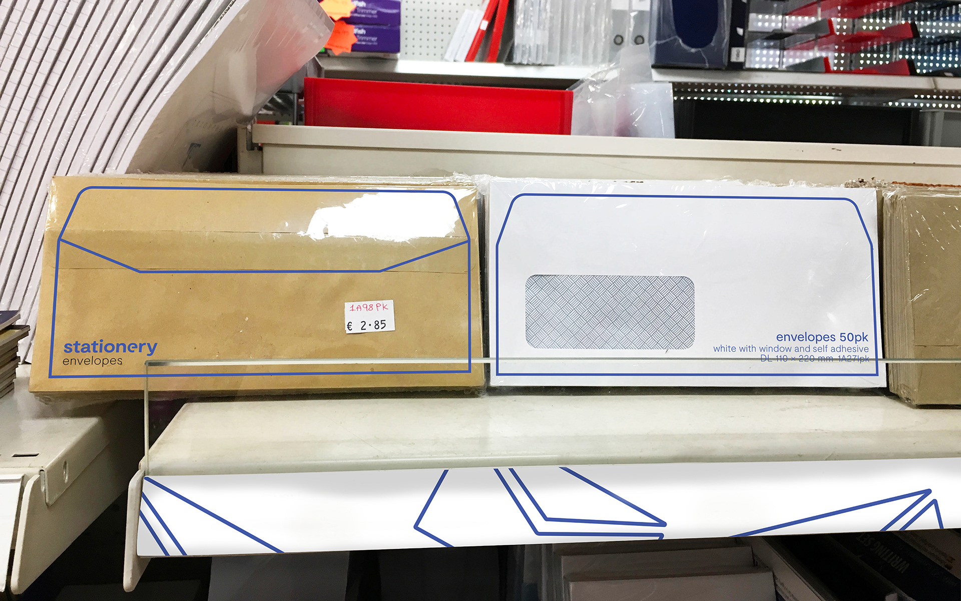
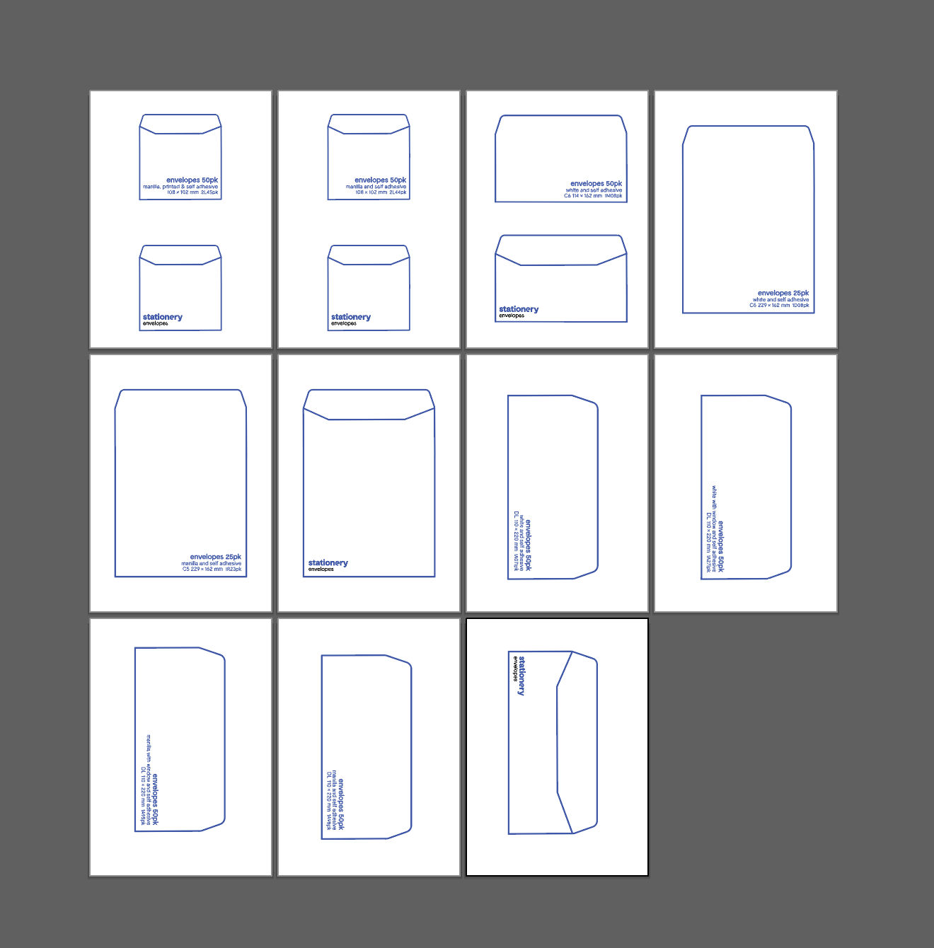
The Stationery Store also offers a bunch of own brand items, but didn't brand them bar a price tag. Taking pride in their own line of stationery, a new range of secondary sub-brands were created along with packaging designs to cohere the entire identity.
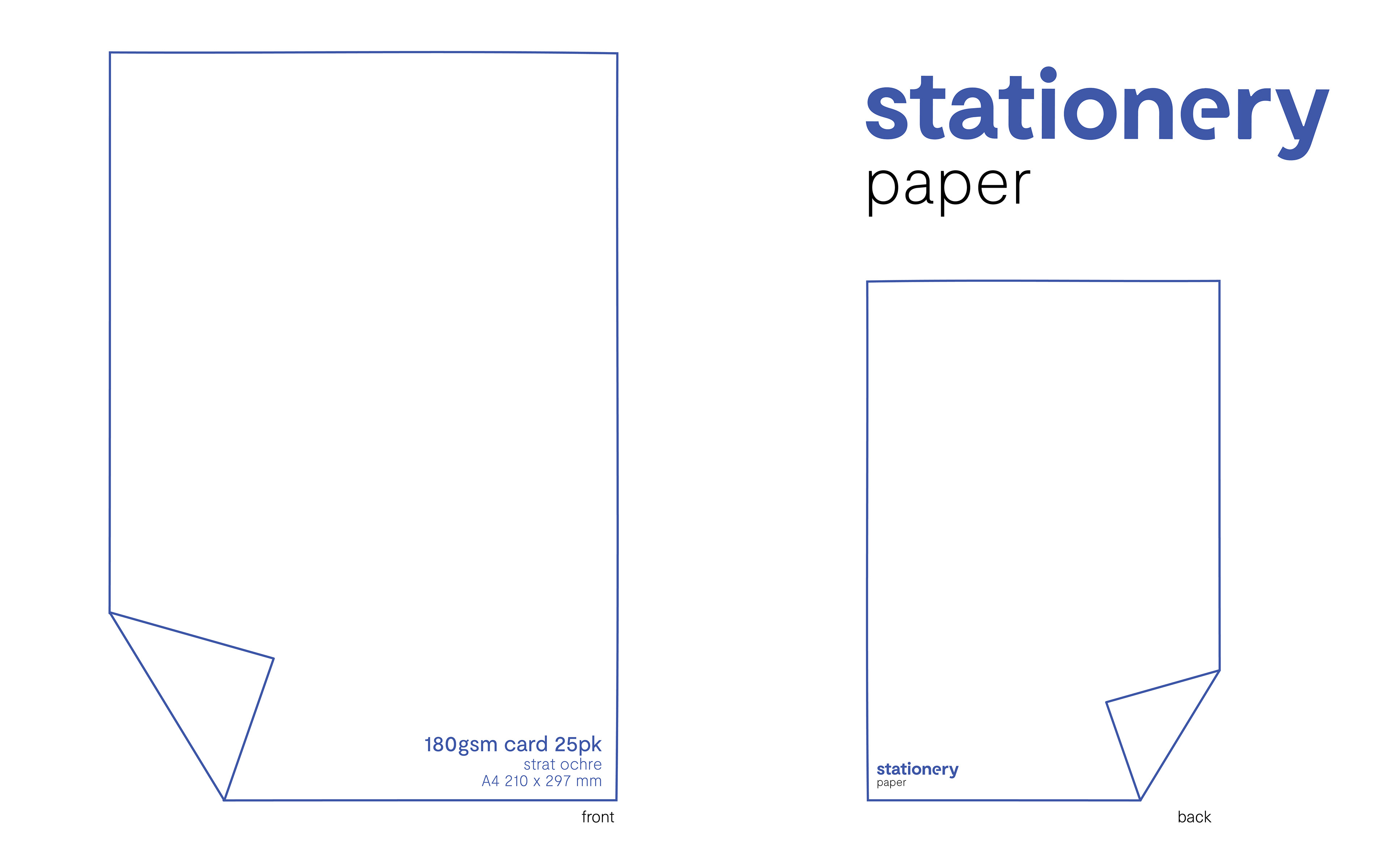
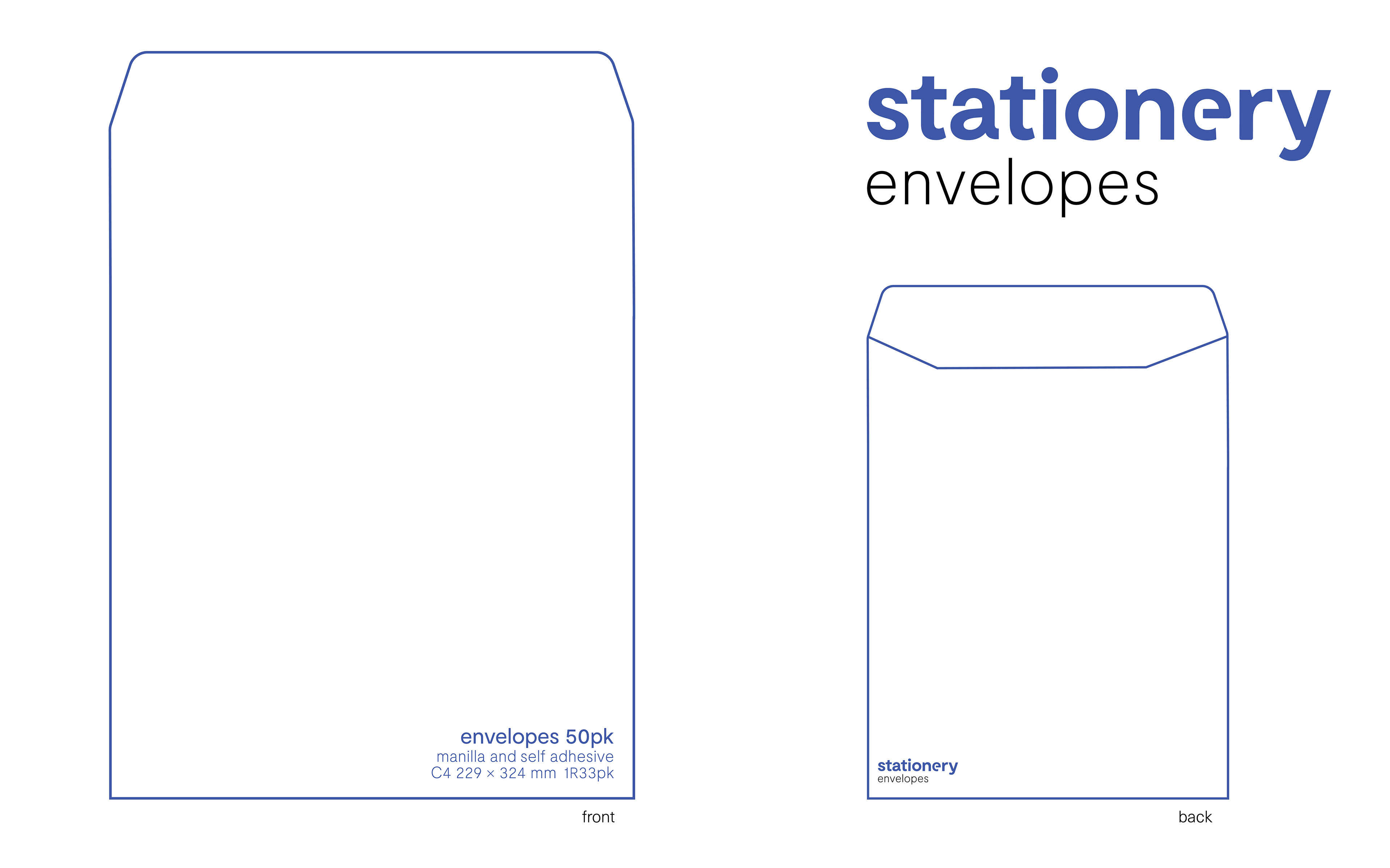
The packaging for these offerings had a front and back, to display what was inside. What you see is what you get here, and it was important that the packaging visualised this.
As with any business these days, an online presence is valuable and necessary to survive. While The Stationery Store have been ahead of the game in this aspect (they've had Twitter since 2011!) a series of social media concepts were created. A proposal for a new website was also developed.
If you're in the area pop in. You will not be dissapointed.